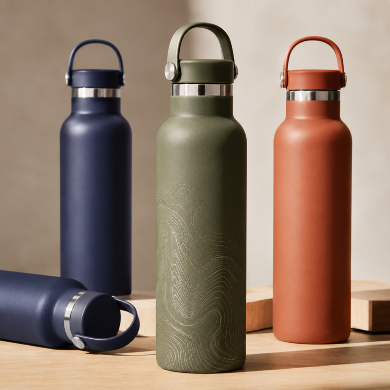
Commentaires fermés sur Comment choisir les couleurs et les finitions des bouteilles d'eau personnalisées
Quick Answer
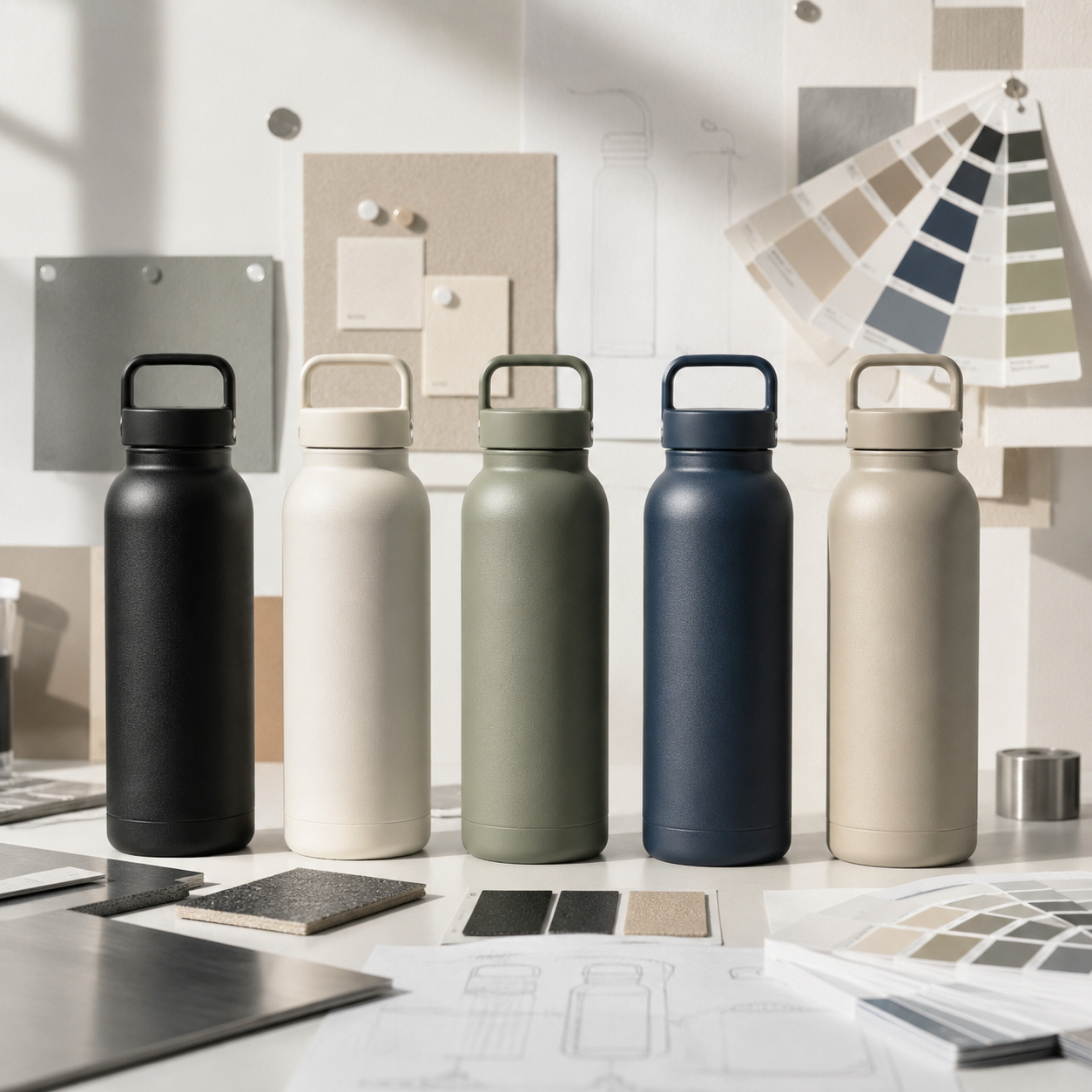
The right color and finish can influence how customers perceive quality before they ever test insulation or durability. While trend colors attract attention, timeless shades such as matte black, cream, navy, and sage green usually generate stronger long-term sales. Successful brands don’t simply choose attractive colors—they build collections that match their customers’ lifestyles, brand positioning, and retail strategy.
For most new private-label drinkware collections, starting with four to six carefully selected colors and one or two complementary finishes provides the best balance between customer choice, inventory efficiency, and manufacturing consistency.
Why Color Is More Than a Design Decision
When brands develop a new custom water bottle, most conversations begin with capacity, insulation performance, or lid design.
Color is often discussed much later.
Ironically, color is usually one of the first things customers notice.
Whether someone is browsing an online marketplace, walking through a retail store, or scrolling social media, they make an instant judgment before reading specifications like18/8 acier inoxydable, isolation sous vide à double paroi, ou BPA-free materials.
The bottle simply looks premium.
Or it doesn’t.
That first impression happens in seconds, but it can determine whether customers continue exploring the product or move on to another option.
This is why successful drinkware brands don’t treat color as decoration.
They treat it as part of product strategy.
Customers Buy With Their Eyes Before They Read the Specifications
Imagine two insulated bottles with exactly the same specifications.
Double-wall vacuum insulation
Acier inoxydable de qualité alimentaire
Leak-proof lid
Identical capacity
Same retail price
One uses a smooth glossy coating in a bright seasonal color.
The other features a textured matte finish in a warm neutral tone.
Technically, both products perform the same.
Commercially, they may perform very differently.
Customers naturally associate certain colors and textures with durability, qualité, and lifestyle. Before they understand how well a bottle keeps drinks cold, they have already formed expectations about its value.
Color creates perception.
Surface finish reinforces it.
Together, they influence how premium a product feels.
This explains why brands should never evaluate color independently from finish.
A Pantone color chip cannot fully represent how the finished bottle will look in a customer’s hand.
Brand Insight: Customers Rarely Buy a Color—They Buy an Identity
Many first-time brand owners ask:
« Which color sells best? »
A better question is:
« Which colors represent the lifestyle my customers want? »
People don’t carry reusable bottles only to stay hydrated.
They carry them into offices.
Gyms.
Universities.
Coffee shops.
Airports.
Camping trips.
Morning commutes.
The bottle becomes part of their daily routine.
Because of this, customers often choose colors that fit naturally into their lifestyle rather than colors that simply attract attention.
Par exemple:
A technology company launching premium corporate gifts may benefit from matte black, graphite, and deep navy because these colors communicate professionalism and durability.
A wellness brand may achieve stronger results using cream, sand, sage green, and muted clay, which naturally reinforce ideas of balance and sustainability.
An outdoor brand often succeeds with forest green, slate blue, charcoal, and earth-inspired finishes that reflect adventure and resilience.
In every case, the objective isn’t choosing the most fashionable color.
Il’s choosing the color customers feel comfortable carrying every day.
Why Surface Finish Can Matter More Than Color
Many buyers focus heavily on selecting the perfect Pantone shade while overlooking something equally important:
The surface finish.
Yet two bottles produced in exactly the same color can create completely different impressions depending on how that color is applied.
Consider matte black.
When finished with a high-quality electrostatic powder coating, it appears refined, modern, and durable.
The subtle texture reduces fingerprints, improves grip, and gives the bottle a premium tactile feel.
Now imagine the same black finished with a glossy liquid coating.
The color hasn’t changed.
The perception has.
The glossy surface reflects light differently, making the product appear brighter, smoother, and often more promotional than premium.
Neither finish is inherently better.
Each supports a different market position.
Brands targeting outdoor retailers, fitness products, and premium corporate gifts increasingly favor matte powder-coated finishes because they combine visual sophistication with everyday durability.
Glossy finishes remain popular for children’s drinkware, promotional campaigns, and products where vibrant colors are the primary selling point.
The finish doesn’t simply protect the bottle.
It shapes how customers interpret the color itself.
Factory Perspective: What We See During Product Development
Chez Jarrino, one pattern appears repeatedly during OEM projects.
New customers often spend weeks discussing bottle colors before considering how those colors will actually be manufactured.
Only after reviewing prototype samples do they realize that the same Pantone reference can look noticeably different depending on coating thickness, curing temperature, surface texture, lighting conditions, and the material underneath.
This is why experienced manufacturers encourage physical sample approval rather than relying only on digital renderings.
Screen colors are useful for discussion.
Production samples are essential for decision-making.
Another common observation involves product launches.
Many first-time buyers initially request eight, ten, or even twelve different colors because they believe more choice will increase sales.
After reviewing MOQ requirements, packaging complexity, warehouse space, and production planning, most decide to launch with a smaller collection of carefully selected colors instead.
Interestingly, these focused collections often perform better because customers find them easier to understand, retailers manage inventory more efficiently, and brands gather clearer sales data before expanding their product range.
From a manufacturing perspective, successful collections are rarely the largest.
They are usually the most intentional.
A Simple Principle Before Choosing Any Color
Before approving any Pantone reference or surface finish, ask one simple question:
Will our customers still enjoy carrying this bottle a year from now?
If the answer is uncertain, the decision probably needs more discussion.
Trend colors may generate attention for a season.
Timeless colors build repeat orders.
The strongest custom drinkware collections usually balance both.
One or two trend colors can create excitement.
Core colors create long-term business.
That balance is where successful bottle collections begin.
Why Some Colors Continue to Outsell Seasonal Trends
Every year, the design world introduces a new « Color of the Year. » Fashion brands embrace it, social media celebrates it, and product designers begin imagining how it might appear on everything from sneakers to coffee mugs.
Drinkware brands often feel pressure to follow.
But successful product collections don’t always follow the loudest trends.
They follow customer behavior.
A reusable water bottle is different from a T-shirt or a phone case. Most people expect to use it every day—for work, commuting, voyage, exercise, or outdoor activities. That means customers naturally gravitate toward colors they believe will remain attractive long after seasonal trends disappear.
Trend colors generate curiosity.
Timeless colors generate repeat purchases.
The strongest brands understand the difference.
Instead of replacing their entire collection every year, they introduce one or two seasonal colors while keeping a stable foundation of proven best sellers.
This approach allows brands to stay current without sacrificing long-term sales performance.
The Colors That Continue to Perform Well in 2026
Although color preferences evolve, several categories continue to perform consistently across global markets.
Rather than asking, « Which single color is best? », brands should ask, « Which color category best matches our customers? »
One of the biggest misconceptions in product development is that more colors automatically lead to more sales.
In reality, too many options often create hesitation.
Psychologists refer to this aschoice overload—when customers face too many similar options, they become less confident about making a decision.
The same principle applies to drinkware.
A collection with twelve nearly identical shades of blue may appear impressive in a catalog, but it can confuse customers and increase inventory complexity.
A focused collection of four to six carefully selected colors often performs better because each option has a clear purpose.
Successful brands simplify decisions.
They don’t complicate them.
Why Regional Preferences Matter
Global brands quickly discover that color preferences are not universal.
Climate, culture, fashion trends, and even workplace habits influence what people are willing to carry every day.
Par exemple:
Region
Primary Preferred Palette
Dominant Finish
Target Market / Segment
North America
Matte Black, Forest Green, Navy, Warm Cream
Powder-coated Matte
Outdoor Gear, Fitness, Corporate Gifts
Northern Europe
Sandstone, Muted Clay, Charcoal, Soft Sage
Minimalist Low-Gloss
Specialty Coffee, Lifestyle Retail
Southeast Asia
Vibrant Coral, Electric Blue, Bright Accent Colors
Glossy & Metallic
Promotional Events, Youth Retail
Middle East
Obsidian Black, Deep Royal Blue, Metallic Accents
High-Gloss & Satin
Premium Gifting, Luxury Retail
Factory Perspective: One Global Color Strategy Rarely Works
Chez Jarrino, we occasionally work with customers preparing products for multiple international markets.
A common assumption is that one universal color collection will satisfy every region.
In practice, that’s rarely the case.
A matte cream bottle that performs exceptionally well in Northern Europe may generate slower sales in markets where brighter colors dominate promotional retail.
Likewise, highly saturated promotional colors may attract attention at trade events but perform less consistently in premium lifestyle stores.
Instead of creating one collection for the entire world, many experienced brands develop aglobal core collectionsupported byregional seasonal colors.
This strategy keeps manufacturing efficient while allowing retailers to adapt products to local customer preferences.
Mat vs. Glossy: Which Finish Fits Your Brand?
To position a drinkware collection effectively, brands must understand that color perception changes drastically based on application technology. Below is a structural comparison between matte powder coating and traditional glossy liquid finishes:
Performance & Market Metric
Matte Powder Coating
Glossy Liquid Finish
Coating Technology
Electrostatic Powder Spray
Wet Spray Painting
Coating Thickness
$60\texte{–}80\,\mu\text{m}$ (Durable layer)
$20\texte{–}30\,\mu\text{m}$ (Thin layer)
Adhesion Rating
ISO 2409 Class 0 / ASTM 5B
ISO 2409 Class 1 / ASTM 4B
Tactile Experience
Subtle texture, poignée sans glissement
Lisse, reflective surface
Fingerprint & Smudge Resistance
Excellent
Low (Prone to smudges)
Scratch & Abrasion Resistance
Haut (Ideal for outdoor & everyday use)
Moderate (Prone to hairline scratches)
Target Retail Positioning
Premium lifestyle, de plein air, aptitude, corporate
Manufacturing Reality:A single Pantone shade will reflect light differently depending on this choice. Matte finishes absorb ambient light to produce a deeper, warmer tone, while glossy finishes reflect light, making colors appear significantly brighter and more saturated.
Why Texture Changes the Way Customers See Color
Here’s something many first-time buyers don’t expect.
Two bottles can use the exact same Pantone color reference and still look noticeably different.
The difference comes from texture.
A textured matte surface absorbs light.
A glossy surface reflects it.
As a result, the same color may appear softer, warmer, deeper, or brighter depending on the finish.
This is one reason experienced manufacturers recommend approving physical samples instead of relying solely on digital artwork.
Color is never just color.
It is the combination of pigment, coating technology, texture, lighting, and material.
Buying Advice: Don’t Start with Your Favorite Color
When developing a new bottle collection, many founders naturally choose colors they personally like.
That approach can work—but only if personal preference matches customer demand.
A better approach is to ask three practical questions:
Where will customers use this bottle most often?
What impression should the product create?
Will this color still feel relevant after the current trend fades?
These questions shift the conversation from personal taste to commercial strategy.
That’s exactly how experienced product teams approach color planning.
Building a Color Collection That Sells
One of the biggest mistakes first-time brand owners make is assuming that every attractive color deserves a place in their product lineup.
In reality, successful collections are rarely built around individual colors.
They are built around a clear strategy.
A customer doesn’t compare your black bottle with your blue bottle.
They compare your entire collection with a competitor’s collection.
That means every color should have a purpose.
Some colors generate consistent revenue.
Some strengthen brand identity.
Others create seasonal excitement.
When each color plays a different role, the collection becomes easier to market, easier to manage, and easier for customers to understand.
The Five-Color Strategy Many Successful Brands Follow
Chez Jarrino, nous’ve found that many successful private-label launches begin with a focused collection rather than a large catalog.
Instead of introducing ten or more colors, brands often achieve stronger results with five carefully selected options.
A practical framework looks like this:
Role
Example Colors
But
Core Bestseller
Matte Black
The most reliable everyday option
Modern Neutral
Cream, Sandstone
Appeals to lifestyle and office users
Nature-Inspired
Sage Green, Forest Green
Outdoor and wellness positioning
Signature Brand Color
Brand-specific Pantone
Strengthens recognition
Seasonal Accent
Coral, Sky Blue, Burgundy
Creates freshness without expanding the core range
Each color has a job.
Instead of competing with one another, they work together to create a balanced product line.
This approach also simplifies inventory forecasting because each SKU serves a different customer need.
Brand Insight: Great Collections Feel Intentional
Customers rarely think,
« This brand has twelve colors. »
Instead, they think,
« This brand feels premium. »
That feeling comes from consistency.
The colors complement one another.
The finishes share the same visual language.
Packaging reinforces the same aesthetic.
Even product photography reflects a unified identity.
Brands that launch random colors often look inconsistent.
Brands that launch curated collections appear more professional—even when they offer fewer choices.
In branding, clarity almost always beats quantity.
Why Pantone Matching Matters More Than Most Buyers Realize
Many buyers believe choosing a Pantone reference guarantees consistent production.
Unfortunately, it doesn’t.
A Pantone code is only the starting point.
The final appearance depends on many production variables, including:
Surface preparation
Powder formulation
Coating thickness
Curing temperature
Stainless steel substrate
Surface texture
Ambient lighting
This is why professional manufacturers don’t approve production based solely on digital artwork.
Physical samples remain essential.
Chez Jarrino, Pantone matching is combined with prototype approval to ensure the final product reflects the intended design as closely as possible.
For premium retail collections, maintaining consistent color across multiple production batches is just as important as achieving the correct color the first time.
Factory Perspective: Consistency Builds Trust
One production run may look perfect.
The next must look the same.
Retailers don’t evaluate bottles one shipment at a time.
They evaluate brands over months and years.
If a customer reorders a navy bottle six months later and receives a noticeably different shade, confidence in the brand begins to decline.
This is why experienced OEM manufacturers place as much emphasis on consistency as they do on creativity.
Color control isn’t simply about aesthetics.
Il’s about protecting brand reputation.
Surface Finish Is Also a Quality Decision
Customers often describe a bottle as « high quality » without knowing why.
The explanation frequently lies in the finish.
High-quality powder coating provides more than an attractive appearance.
It also contributes to:
Better grip during daily use
Reduced fingerprint visibility
Greater scratch resistance
Improved long-term appearance
A more refined tactile experience
While glossy coatings remain appropriate for promotional products and children’s drinkware, powder-coated finishes have become the preferred choice for many premium brands because they balance appearance with durability.
Choosing the right finish therefore becomes part of product positioning—not simply manufacturing.
Technical Considerations Before Mass Production
Typical checkpoints include:
Pantone Color Precision:Color variance tolerance strictly controlled within $\Delta E < 1.0$ against approved physical samples.
Thermal & Dishwasher Durability:Dishwasher Safety Verification withstanding a minimum of 50 wash cycles at $60^\circ\text{C}$ without degradation.
Layer Thickness Control:Uniform coating thickness maintained within $60\text{–}80\,\mu\text{m}$ throughout full mass production.
Component Color Uniformity:Strict color coordination across lids, handles, straws, and silicone seal rings.
Common Mistakes Brands Make
Even experienced companies occasionally underestimate the importance of color planning.
Some of the most common mistakes include:
Following Trends Too Closely
A color that dominates social media today may feel outdated next season.
Trend colors work best when they complement timeless colors—not replace them.
Ignoring Surface Finish
Choosing the perfect Pantone shade means little if the finish doesn’t match the intended brand image.
Color and finish should always be considered together.
Launching Too Many SKUs
A larger collection increases production complexity, inventory costs, and purchasing uncertainty.
Starting with a focused lineup allows brands to expand based on real sales data.
Approving Colors Only on a Screen
Digital displays vary dramatically.
Physical production samples remain the most reliable reference before mass manufacturing.
Buying Advice: Ask Better Questions Before Production
Before confirming your first order, ask your manufacturer these questions:
Can this color be reproduced consistently across future production runs?
Which finish best supports my brand positioning?
Will the chosen coating remain attractive after everyday use?
Does this color fit the markets where my products will be sold?
Which colors are most frequently reordered by similar brands?
The quality of your questions often determines the quality of your product decisions.
Decision Framework
When evaluating colors and finishes, avoid asking:
Which color is the most popular?
Instead, ask:
Which color reflects our brand identity?
Which finish communicates the level of quality we want customers to expect?
Which collection will still look relevant two years from now?
Which combination simplifies inventory while giving customers meaningful choice?
These questions move the conversation away from fashion and toward long-term product strategy.
Choosing the Right Manufacturing Partner Is Part of Your Color Strategy
Many brands think color decisions end once a Pantone code has been selected.
In reality, that’s where the manufacturing process begins.
The ability to reproduce the same color consistently—from the first prototype to future production runs—depends on the manufacturer’s production control, coating technology, quality inspection, and experience.
A beautiful color on a digital rendering has little value if it cannot be reproduced reliably at scale.
This is why choosing a manufacturing partner is also part of choosing your product colors.
Why Production Consistency Matters More Than Perfect Color
Many buyers spend weeks selecting the perfect shade.
Experienced product teams spend just as much time making sure that shade remains consistent over time.
Customers rarely compare a bottle against a Pantone color card.
Instead, they compare today’s purchase with the one they bought six months ago.
If the colors no longer match, customers notice.
Retailers notice.
Brand reputation is affected.
Consistency builds trust.
That is why leading OEM manufacturers place equal importance on color control, coating stability, and repeatable production processes.
How Jarrino Supports Color and Finish Development
Developing a successful bottle collection requires more than manufacturing capability.
It requires collaboration between product designers, sourcing teams, and production engineers.
À Jarrino, our goal is not simply to manufacture custom drinkware.
We help brands reduce uncertainty before mass production begins.
Our OEM and ODM services are designed to support every stage of product development, including:
Pantone color matching for stainless steel bottles and tumblers
Matte powder coating and glossy finish options for different market positions
Physical prototype sampling before production approval
Consistent color coordination across bottle bodies, lids, handles, straws, and silicone components
Quality control procedures that help maintain production consistency from initial sampling to repeat orders
Rather than encouraging brands to follow every seasonal trend, we work with customers to build collections that remain commercially relevant over time.
Because the best-selling products are rarely those with the most colors.
They are the ones with the clearest strategy.
Before Approving Your Next Bottle Collection
Before placing your next OEM order, take a moment to review these questions:
Brand Positioning
Do these colors reflect how we want customers to perceive our brand?
Will the finish reinforce that perception?
Customer Experience
Will customers still enjoy using this bottle every day a year from now?
Does the collection feel cohesive rather than random?
Manufacturing Readiness
Have physical samples been approved?
Can the factory reproduce these colors consistently?
Are all components visually coordinated?
Commercial Strategy
Does every SKU serve a clear purpose?
Are we introducing meaningful choice instead of unnecessary complexity?
If you can confidently answeryesto these questions, your collection is likely built on a stronger foundation than simply following the latest trend report.
Frequently Asked Questions
What color is best for custom water bottles?
There isn’t a single best color for every brand.
The most effective choice depends on your target audience, product positioning, and retail environment.
For many premium collections, matte black, warm neutrals, navy blue, and sage green remain strong long-term performers because they fit naturally into everyday lifestyles.
Should I choose matte or glossy finishes?
Neither finish is universally better.
Matte powder-coated finishes are often preferred for premium retail, outdoor products, and corporate gifts because they offer a refined appearance and improved durability.
Glossy finishes work well for promotional campaigns, children’s products, and collections where bright colors are the main attraction.
How many colors should a new product line launch with?
Many successful brands begin with four to six carefully selected colors.
This provides customers with meaningful choice while keeping production, inventory, and forecasting manageable.
Additional colors can be introduced later based on real market demand.
Why is Pantone matching important?
Pantone references provide a common color language between brands and manufacturers.
Cependant, achieving consistent production also depends on coating technology, material preparation, contrôle de qualité, and sample approval.
Physical prototypes remain an essential step before mass production.
Can the same Pantone color look different?
Oui.
Surface finish, coating thickness, lighting conditions, material texture, and manufacturing processes all influence the final appearance.
This is why evaluating physical samples is recommended before confirming production.
Key Takeaways
If there’s one lesson from this guide, il’s this:
Choosing colors and finishes is not simply a design exercise.
It is a business decision.
The most successful custom water bottle collections rarely rely on trend reports alone.
Instead, they combine customer understanding, consistent branding, practical inventory planning, and reliable manufacturing.
Color attracts attention.
Finish shapes perception.
Consistency builds trust.
When all three work together, brands create products that customers are happy to carry—and retailers are confident to reorder.
Final Thoughts
Every year brings new color trends.
Some will become social media favorites.
Others will disappear as quickly as they arrived.
But the strongest drinkware brands rarely build their collections around what is fashionable for a single season.
They build products that continue to look relevant long after trends change.
That usually means selecting colors that fit everyday life, finishes that communicate quality, and manufacturing partners capable of delivering consistent results over time.
For brands developing custom water bottles, choosing the right colors is only the beginning.
Choosing the right strategy is what creates lasting success.
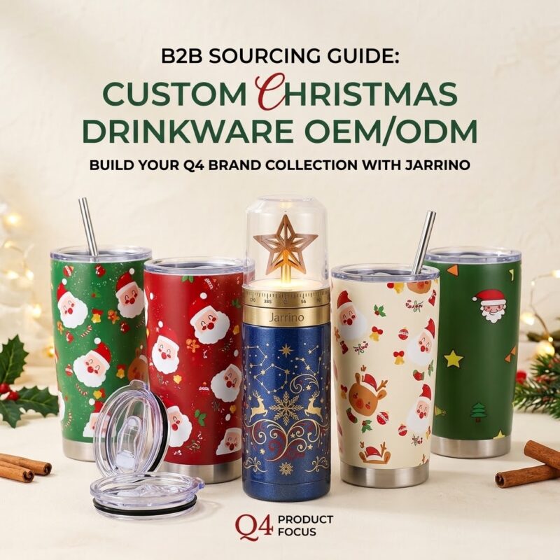
Jarrino est un fabricant certifié OEM/ODM spécialisé dans les flacons à vide personnalisés, gobelets doublés de céramique, et verres en titane. Les délais de livraison pour les commandes de Noël personnalisées du quatrième trimestre sont de 20 à 30 jours avec de faibles MOQ (300–1 000 pièces) et conformité totale FDA/LFGB. Nous proposons une personnalisation de bout en bout, y compris l'impression numérique 3D, gravure laser, et emballages cadeaux de Noël sur mesure. Des kits d'échantillons et des devis sont disponibles sur demande pour aider les marques à sécuriser en douceur la production des fêtes du quatrième trimestre..
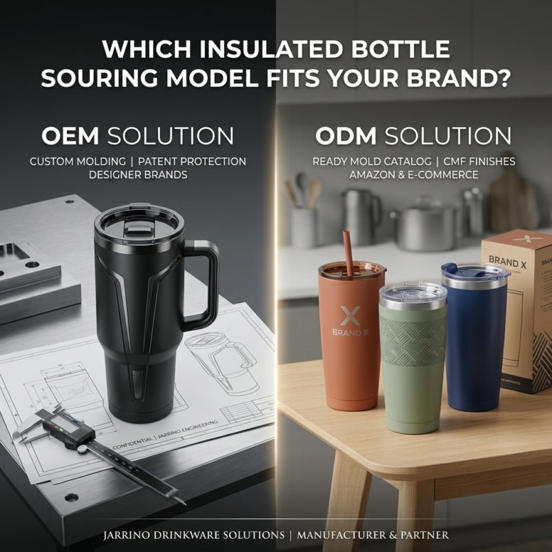
Choisir entre OEM (Fabrication d'équipement d'origine) et ODM (Fabrication de conception originale) définit le R de votre marque de verres&Budget D, délai de mise sur le marché, et l'exclusivité du produit. L'OEM est idéal pour les marques établies avec des conceptions CAO personnalisées et des exigences IP uniques, offre 100% moulage sur mesure et protection par brevet. ODM est conçu pour les vendeurs Amazon, Startups DTC, et les acheteurs d'entreprise recherchant des coûts d'outillage nuls, faibles MOQ, et des lancements de produits rapides via des finitions CMF avancées (revêtement en poudre, Impression UV).
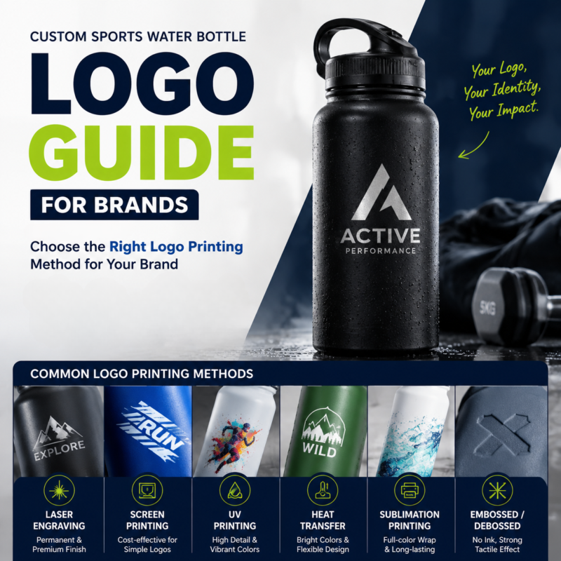
Les logos personnalisés de bouteilles d'eau de sport sont créés grâce à différents processus de décoration en fonction du matériau de la bouteille., conception de marque, et exigences de performance. Ce guide couvre les méthodes d'impression de logo les plus courantes, y compris la gravure au laser, sérigraphie, Impression UV, transfert de chaleur, et sublimation, aider les marques de sport à sélectionner la bonne option de personnalisation pour des produits de boisson durables et professionnels.
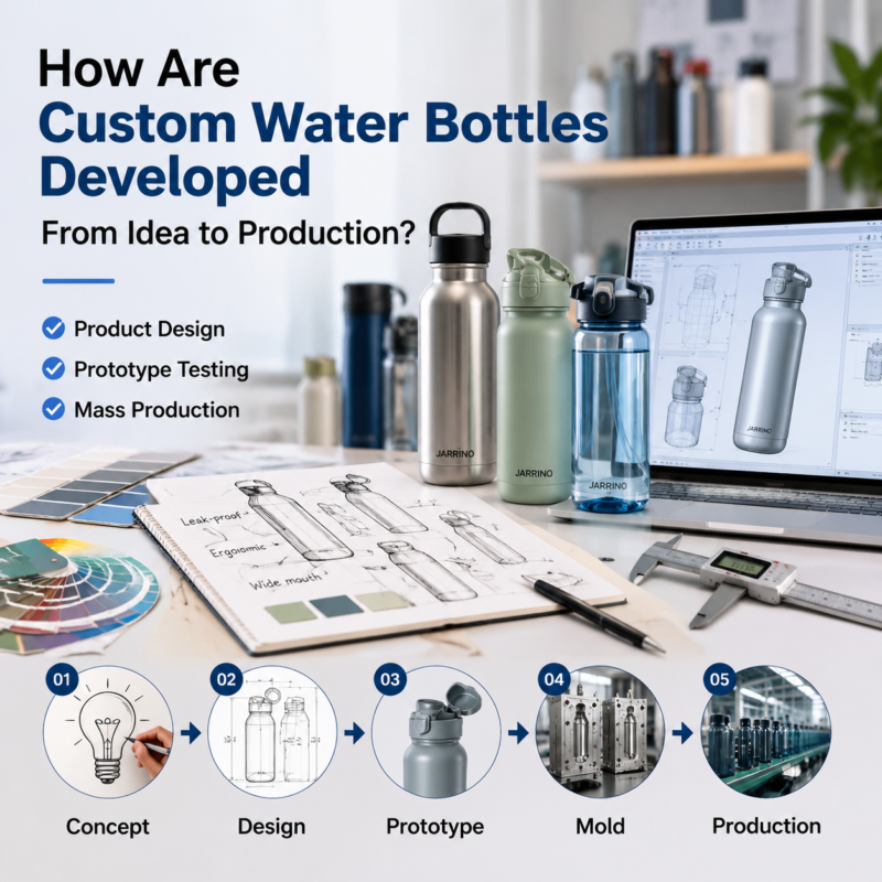
Développer une bouteille d'eau personnalisée nécessite bien plus que choisir un design et ajouter un logo.. Du concept produit initial à l'ingénierie, prototypage, développement de moisissures, essai, et production de masse, chaque étape joue un rôle important dans la création d'un produit de boisson réussi. Ce guide explique comment les marques travaillent avec les fabricants de bouteilles d'eau OEM pour transformer les idées en produits de haute qualité., produits prêts à être commercialisés tout en gérant la conception, coût, et les défis de production.
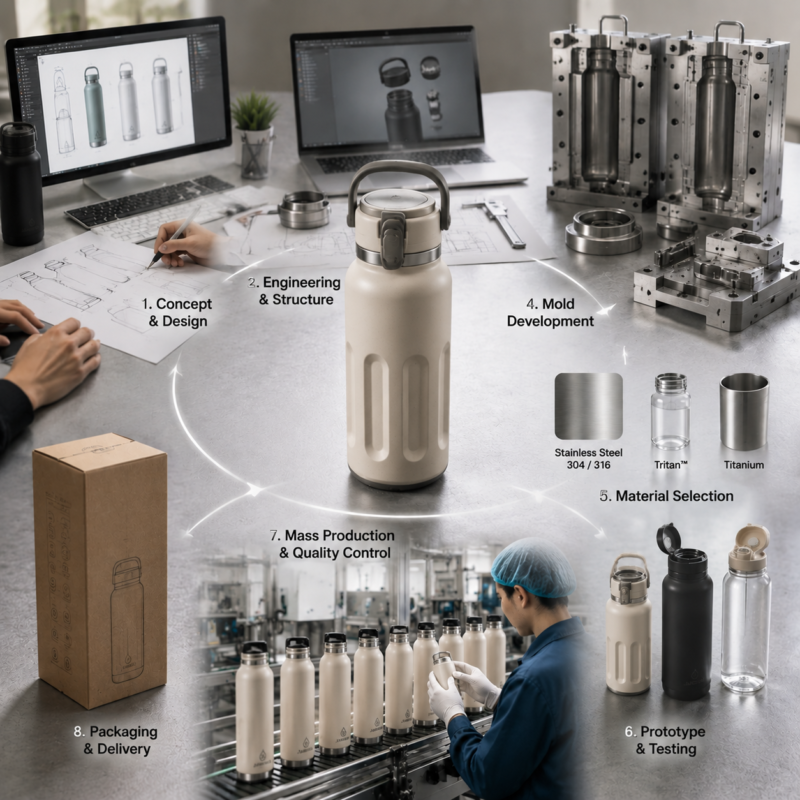
Développer une bouteille d’eau entièrement personnalisée implique bien plus que l’ajout d’un logo à un produit existant. Ce guide explique comment les marques créent des bouteilles d'eau uniques grâce à la conception de produits., ingénierie, sélection des matériaux, développement de moisissures, tests de prototypes, et production de masse. Découvrez comment un fabricant de bouteilles d'eau OEM expérimenté contribue à transformer une idée en un produit prêt à être commercialisé tout en gérant la qualité., coût, et efficacité de production.
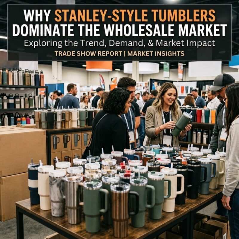
Les gobelets de style Stanley sont devenus un phénomène culturel et un best-seller en gros. Cet article explore pourquoi – de 18/8 acier inoxydable et isolation sous vide à double paroi pour une valeur perçue élevée, potentiel de personnalisation, et une demande constante de commandes répétées. Découvrez ce qui fait de ces gobelets un produit fiable, catégorie rentable pour les acheteurs en gros.
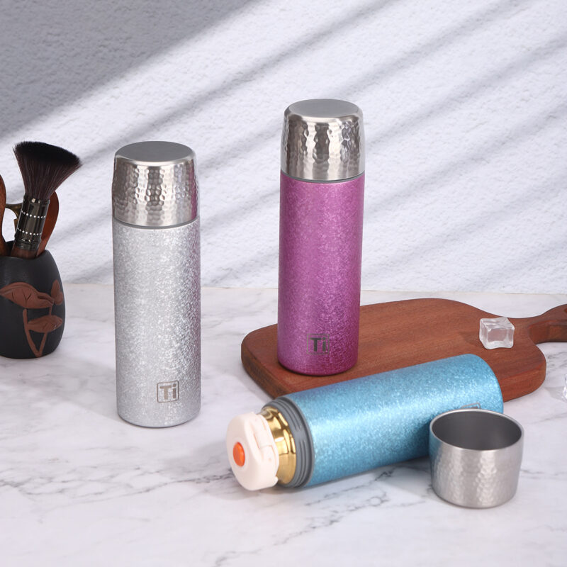
Le titane est sans danger. C'est aussi cher. Voici comment il se compare à l’acier inoxydable et à l’aluminium – et quel matériau est réellement adapté à votre marque..
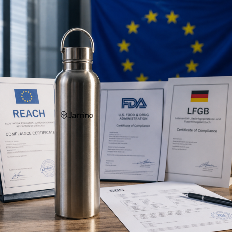
Découvrez comment le règlement européen sur les microplastiques (UE) 2026/1168 impacte les fabricants de bouteilles d’eau personnalisées et les marques de verres de marque privée. Découvrez comment Jarrino aide les importateurs à rester conformes à REACH avec des bouteilles d'eau durables en acier inoxydable.
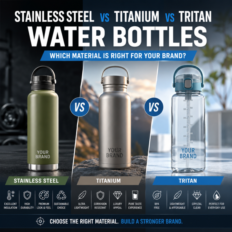
Choosing the right water bottle material can significantly impact your product quality, pricing, and brand positioning. This guide compares stainless steel, titane, and Tritan water bottles across durability, isolation, coût, personnalisation, and sustainability to help brands, détaillants, and OEM buyers select the best material for their target market.
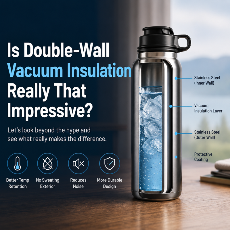
Double‑wall vacuum insulation is standard in premium drinkware, but the difference between a bottle that performs and one that disappoints comes down to manufacturing quality. This guide explains how vacuum insulation works, sets realistic performance expectations, and gives B2B buyers a practical checklist for evaluating suppliers. Plus, why Jarrino’s strict quality standards ensure your custom bottles deliver on their promises.
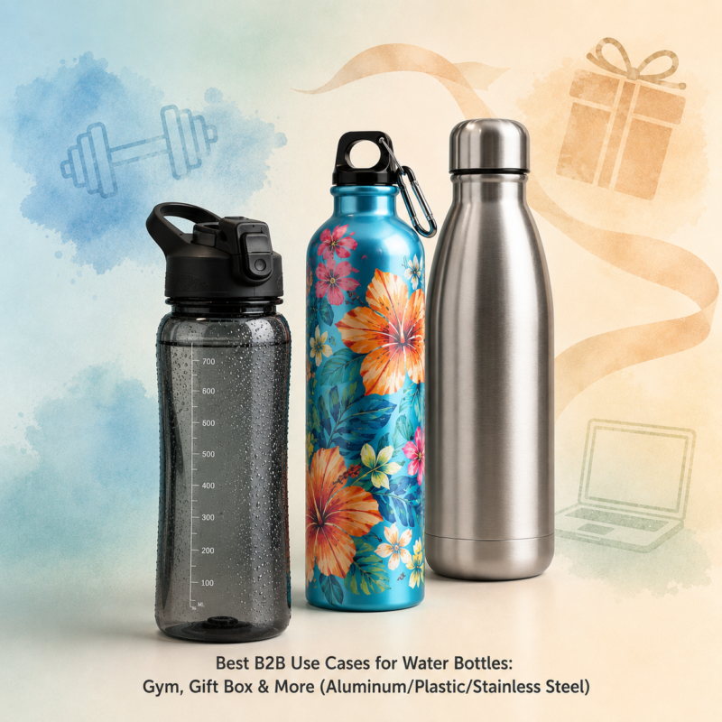
Toutes les bouteilles d’eau ne conviennent pas à tous les cas d’utilisation B2B. Cet article correspond à trois matériaux : l'acier inoxydable, aluminium, plastique — aux applications du monde réel: gymnases, coffrets cadeaux d'entreprise, salons professionnels, vente au détail en plein air, et programmes scolaires. L'acier inoxydable gagne en durabilité et en isolation. L'aluminium offre de la légèreté, marquage en couleur. Le plastique est économique pour les événements à grand volume (à condition qu'il soit sans BPA). Une aide-mémoire rapide aide les acheteurs B2B à équilibrer les coûts, image de marque, et les attentes des utilisateurs.
Gravure laser, sublimation, UV, ou sérigraphie – quelle décoration de bouteille personnalisée survit réellement à une utilisation quotidienne? Nous les avons testés. Lire les résultats.
Pour offrir les meilleures expériences, nous utilisons des technologies telles que les cookies pour stocker et/ou accéder aux informations sur l'appareil. Le consentement à ces technologies nous permettra de traiter des données telles que le comportement de navigation ou des identifiants uniques sur ce site.. Ne pas consentir ou retirer son consentement, peut affecter négativement certaines caractéristiques et fonctions.
Fonctionnel
Toujours activé
Le stockage ou l'accès technique est strictement nécessaire à la finalité légitime de permettre l'utilisation d'un service spécifique explicitement demandé par l'abonné ou l'utilisateur., ou aux seules fins d'effectuer la transmission d'une communication sur un réseau de communications électroniques.
Préférences
Le stockage ou l'accès technique est nécessaire dans le but légitime de stocker des préférences qui ne sont pas demandées par l'abonné ou l'utilisateur..
Statistiques
Le stockage ou l'accès technique utilisé exclusivement à des fins statistiques.Le stockage ou l'accès technique utilisé exclusivement à des fins statistiques anonymes. Sans assignation à comparaître, conformité volontaire de la part de votre fournisseur d'accès Internet, ou des enregistrements supplémentaires provenant d'un tiers, les informations stockées ou récupérées à cette seule fin ne peuvent généralement pas être utilisées pour vous identifier.
Commercialisation
Le stockage ou l'accès technique est nécessaire pour créer des profils d'utilisateurs pour envoyer de la publicité., ou pour suivre l'utilisateur sur un site Web ou sur plusieurs sites Web à des fins de marketing similaires.